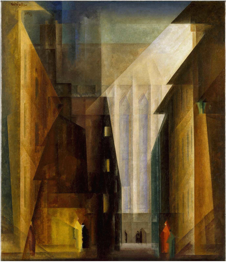
The exhibit is a great one, even if it’s a bit small and shortchanges his late work and drawings (which I think have another exhibit devoted to them somewhere or other). I do love Feininger’s work, and he’s probably the artist where I felt the biggest gap between looking at reproductions of his work and seeing the paintings close up. Especially with his post-Bauhaus work in the 1920s, the use of color gets tricky to figure because the lines are so straight and sharp while the color is so diffuse.
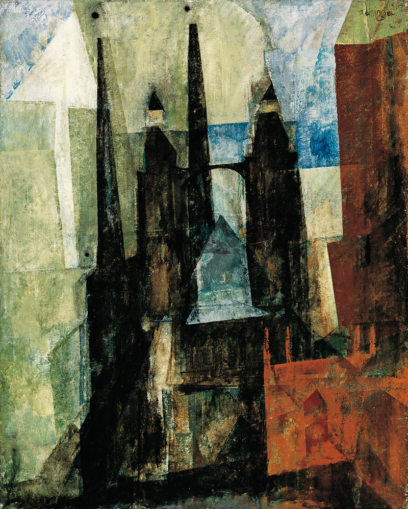
I now think of Church of the Minorites II as his absolute masterpiece, but I never would have prior to seeing it up close.
The sheer lack of definition of the green lamp on the right, for example, is nowhere near as noticeable. Likewise with the general use of light and shading. This painting is representative of the style probably most closely associated with him, the austere post-Bauhaus view of architecture mixed with sensuous colors. At least of the paintings on exhibit, it stands out as being concertedly richer and massive.
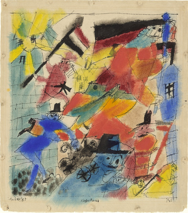
But Feininger’s development does not move in a straight line. There are certainly general shifts, but even within a period he seems to echo back to different styles that he had earlier used. You can’t really say that his work got smoother or more bloodless over the years, because rough and jagged bits reemerge sporadically, even as he made heavier use of much smoother textures. Four years after the above painting he did this:
The arrow seems to have been borrowed from Paul Klee.
Euphoric Victory has a Kandinsky-ish feel to it, but feels more dramatic to me than any Kandinsky.
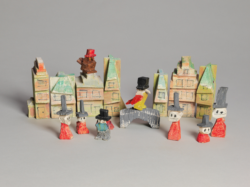
He did, however, mostly move away from drawing people, who generally get reduced to clothing with triangle heads, except for his carved toys, which include chickens and owls with hats among the figures.
His angular shading of buildings also translates remarkably well into three dimensions, though you can’t really tell from this picture.
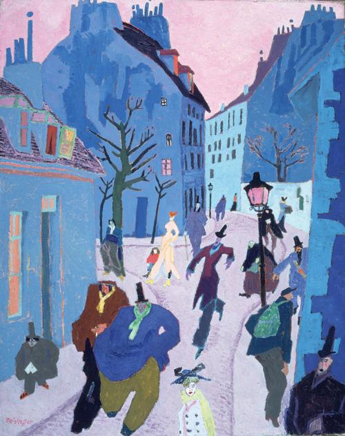
In those early years, his people often had obtuse angles and unsteady curves and the small head/big body combo weirdly anticipates Crumb’s Keep On Truckin’-era work.
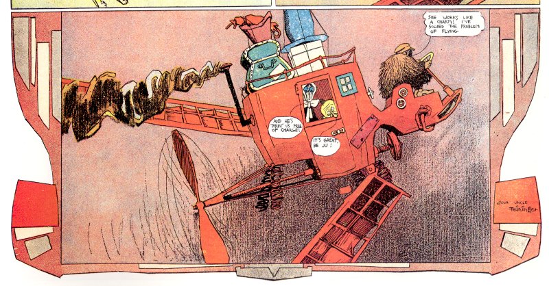
His comics, which influenced Chris Ware among others, have a more lurching, blocky feeling to them. This panel reminds me of The Triplets of Belleville:
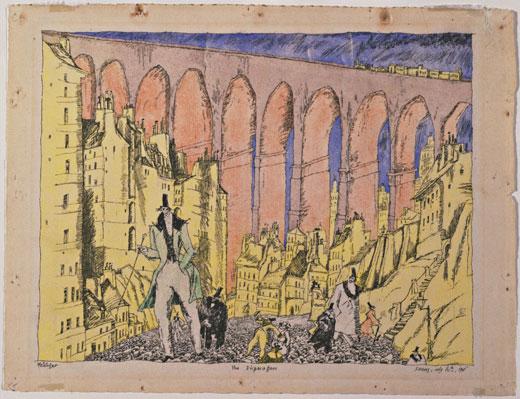
The limits of newspaper printing required higher-contrast lines; his penwork was finer:
Yet the frail linework here would return much later in his career in the 1940s. The bolder and generally straighter lines of the 20s were replaced by the suggestion of texture by single lines more than by color. The show doesn’t have much from the late period; I wish they had had some things like the gorgeous Mystic River.
Feininger wrote a few fugues and that and his “toolbox” approach to painting (he returned to certain buildings and sites repeatedly over long periods, cycling through various aspects of his style, notably with twelve paintings of the Gelmeroda church done over a decade) seem to have suggested a functionalist, engineer’s approach to painting.
It also makes his career much more non-linear than many would have it, those who praise the early stuff and dismiss the later work. (Critics seem to like artists who have more distinct periods.) Don’t be fooled; see the exhibit.
More Feininger available at Mid-centuria, Art Tattler, and on the comics, at Mad Ink Beard.
